Photography
La vie en rose.
Nein, der Titel des Posts
La vie en rose (Life in Pink) bezieht sich nicht auf den Film über Edith Piaf. Die Reise geht nach Zentralafrika. Um genau zu sein in den Kongo. Es geht hierbei auch nicht um das Leben einer Person, sondern einer Masse. Denkt man an den Kongo dann kommen eine schlimme Bilder von Krieg, Gewalt, Plünderung, Milizen usw. in den Sinn. Betrachtet man die Bilder von Richard Mosse dann entsteht eine vollkommen entrückte Welt. Alice in Wunderland oder auch Jimi Hendrix treten in den Raum. Es wirkt auf einmal alles total magisch und psychedelisch... halt irgendwie wie Jimi Hendrix auf dem "Are you Experienced" Album Cover. 2 Jahre lang hat Richard Mosse den Osten von Kongo bereist und an seine neuer Serie
Infra gearbeitet. Es ist nicht seine erste Arbeit in einem Gebiet, wo die Geschichte im Land grausam und brutal ist. Schon im Jahre 2008 hat er eine Fotoreihe zum Iraq- Krieg veröffentlicht. Was ist seine Motivation? Er ist geleitet von der Doppeldeutigkeit der Fotografie und dem Wunsch die traumatische, kulturelle Geschichte eines Landes nochmals zu besuchen und neu zu schreiben. In seinem Projekt
Infra,
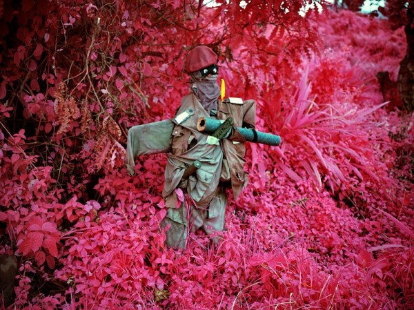
"Mosse documented the ongoing war in the Democratic Republic of Congo using a discontinued type of color infrared surveillance film called Kodak Aerochrome to offer a stunning and radical rethinking of how to depict a complex and intractable conflict. With film that is extra sensitive to green light, he renders the rich typography of the country as well as the camouflage of the Congolese army and combative rebel groups in vivid hues of lavender, crimson, and hot pink.
This is Mosse’s first monograph, co-published by Aperture and the Pulitzer Center on Crisis Reporting. These improbably colored images underline the growing tension between art, fiction, and traditional photojournalism as a way of portraying and communicating the impact of war. Mosse states that the collection works “through shocks to the imagination,” using photography’s unique ability “to make visible what cannot be perceived.” ".
(http://www.aperture.org/exposures/?p=14093)
Drückt es am besten aus.
1#
Nowhere To Run 2010
2#
Taking Tiger Mountain 2011
3#
Come Out (1966) 2011
4#
Growing Up In Public 2011
5#
Even Better Than The Real Thing 2011
6#
House Of Cards V 2011
7#
8#
Men Of Good Fortune 2011
9#
Colonel Soleil's Boys 2010
10#
General Février 2010
11#
Sticky Fingers or LICK THAT SHIT 2011
12#
Vintage Violence North Kivu, Eastern Congo, 2011


amazing blog.. Very different!
AntwortenLöschenthank you :D
Löschenxx
love your blog!!!
AntwortenLöschenxxxxx
http://fashion-memoir.blogspot.com/
http://fashion-memoir.blogspot.com/
http://fashion-memoir.blogspot.com/
http://fashion-memoir.blogspot.com/
Merci <3
LöschenWow these images is magical, my favorite are the third one and the last one. By changing the tone (or whatever i dunno about) of these photos, you really change everything!
AntwortenLöschenAmazing photos. Colour changes everything!
AntwortenLöschenL U A R
x
these photos are just unbelieveable! xox
AntwortenLöschen...wenn man bedenkt, dass dieses Farbspektrum nichtmal falsch, sondern regulär nur einfach nicht wahrnehmbar für uns ist - fast schon mystisch.
AntwortenLöschenEs wirkt total entrückt ..und nimmt dem Bild eine Härte, die sonst zu sehen gewesen wäre.
Löschen<3
xx
so inspiring
AntwortenLöschen